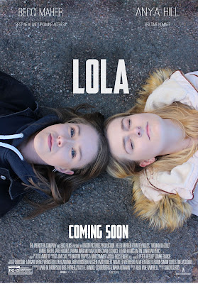
Photoshop construction of main poster
At the beginning of the Photoshop process, I had already chosen the image that I wanted to use therefore it made it easier to start the overall process. The first initial step I took was fairly small and was more of a reassurance to make sure that if anything went wrong I could go back and restore the original photo. This step was creating a double layer of the original photo, by having this there throughout the process was helpful as I'm not 100% familiar with Photoshop.
As the original photos lighting is bright I wanted to keep this a common theme throughout the style of the photo. To replicate this through my characters/model I used the 'patch tool' & 'spot healing tool' to retouch and brighten their completions. I tried to focus on Anya (right) as within my plot her presence is meant to be similar to an 'angel' figure. Therefore where the lighting was brighter, it could connote this to the audience. I also believe that most posters tend to feature 'flawless' models therefore this is an minor element I focused on.

Before going any further designing my poster, I decided to get rid of the bricks at the top of the image as I thought text would be more effective over the overall rubble floor. I used the 'patch tool' again to do this as it was the most simple way to get the look I wanted. When researching film posters I also noticed that most will have one solid colour as the background in order to bring attention to the main focal characters or images on the front. Without the bricks at the top my poster gave the same impression of the block colour however it looks more realistic due to the the texture of the road which conforms to the conventions of the drama genre.
The next step I took was including the title. As seen within my poster flat plans the title could of been placed in two places: above or under the two models. After playing around with the layout with the actual photo the title underneath did not work. By having it above also left more room for the credits and the date to at the bottom. For text I used 'out of my league' which was downloaded from a site called 'Da font'.
I searched for a text which was bold and fairly thick in order for it to be eye catching. I also decided to add a shadow underneath the text to make it appear 3D.
As my theme is focused around mental health and specifically depression, the typical colours used would be darker such as blacks, dark greys etc. As I want to break the stigma that surrounds mental health I felt as if it was important to change certain elements its associated with. For the text I choose to use white mainly due to its significant association with heaven, understanding and faith. The white subverts the stereotypical thoughts about mental heath and could potentially indicate that idea of faith to those of suffer similar issues. As my chosen institution is a mental health platform it is also important to create positives rather than negatives in order to create change.
After the title I added in the credits down the bottom, luckily the colour of these credits match the theme of my posters other text which helped the overall look. I did this by downloading a PNG and inserting it onto my image.
Similar to my title, I put in the 'coming soon' sign and applied the same effects behind the text in order to create that 3D effect. I wanted to keep a theme between all of the text used so it looked clean and professional.
Lastly, I inserted in both of my actors names. I did this in a thinner font than the title and coming soon text as after trying it with the original font it was to thick and squashed together considering the size I wanted. As I did not have any rating or reviews on my poster I decided to insert a line underneath each actress to give away a more information about each actress. 'New and upcoming actress' and '3rd time nominee'.
The final image:


Comments
Post a Comment